Let me guess: you manage a well-structured e-commerce with clearly visible products and categories, you write an informal newsletter to your loyal readers, you are designing an app that will revolutionize productivity and you are very actively promoting your business on social networks - still, you struggle with conversions
Maybe your call to action is not effective or visible enough?
If that’s the case, is there a proven formula for writing a persuasive call to action?
The answer is: there is one, but it’s not universal.
After much testing, CRO expert Michael Aagaard identified an effective CTA template. It is a model which can be applied to the reference context and to all the variables that make your product or service unique. Therefore, it requires some work.
So, if we stirred up your curiosity, keep reading to find out what makes your visitors click on your CTA and how big a difference can make having a clear and engaging call to action.
Table of Contents
1. What is a call to action?
It is often abbreviated as CTA and it is the textual input allowing you to invite your (potential) customers to perform a convenient action for them that corresponds to your marketing target.
UX writing should help your website or app achieve 3 important goals:
- Guiding users along their journey
- Providing users with clear information in line with their needs
- Helping you achieve your marketing goals.
A call-to-action is a microcontent as well as the gateway to conversion.
For example, a good call-to-action for this post might be “READ THIS GUIDE TO WRITE YOUR CTA” because:
- It promises you will learn the basics of writing a custom CTA
- It states the benefit you will get from the reading
- It anticipates the reason why you are here to read
- “Read” is not an ambiguous verb — in order to learn how to write an effective CTA, you will have to read the content we offer
- It guides you — once you click on this CTA, you know what to expect.
If you think a call-to-action always equals a button, you are way off. It may very well be a link or an image, such as the images in the special offers section on the Samsung website — all clickable, indeed.

Anyway, one thing is sure — a call to action must be unambiguous.
We must openly state what we expect our visitor to do to keep the conversation flowing naturally and achieve a win-win situation.
2. The formula for writing an effective CTA
Michael Aagaard has been testing call-to-actions for more than a decade. He is a senior consultant in Conversion Rate Optimization (CRO), that is, he studies how to optimize websites to get them to convert. According to Aagaard the perfect call-to-action formula exists and it is the following:
VALUE + CONSISTENCY = CONVERSION
where by “value” we mean the benefit the user gets from the action he or she will take, while “consistency” refers to the context or specific scenario we are in.
This formula applies to descriptive CTA, those we expect to get a clear and specific outcome from. However, it does not apply to standard CTAs, which are best left expressed in words already familiar to the user. We are going to see the difference shortly.
Each context responds to specific user needs, and a call-to-action has to pop up at the right time in the user’s experience.
But before we go into more detail about the different types of CTAs, we’d like to share another true fact:
A call-to-action alone is not enough.
Undoubtedly, its microtext stands on its own, but if it matches with the text before it, it will be much more effective.
A CTA is engaging when:
-
is coherent: it logically follows we wrote earlier. And if we can succeed in creating a certain imagery in the reader’s mind, the likelihood that they will take the recommended action is much higher.
-
anticipates what will happen after the click: readers like to know in advance. Will the user have to watch a video? Or will he or she receive a freebie?
-
is unique: make space for it. Have no more than one, so there is no confusion.
Of course, CTAs should always be tested according to one’s KPIs and, if necessary, optimized and tweaked as much as possible to meet customers’ needs.
2.1 How to support a CTA: click triggers
A short CTA cannot always say it all, even when preceded by explanatory text. In order to be impactful, it often needs “support” afterwards as well.
A good strategy to reduce the risk of a negative reaction is to use click triggers.
What are click triggers? They consist of supportive information meant to clear out user’s doubts.
- Make sure you add reassuring explanations to reduce uncertainty. For example: “sign up without a credit card”, "sign up in just 2 minutes”, and so on.
Get inspired by Lifesum, health and nutrition app. It reassures the user that the minute he or she spends in signing up will return a lifetime of benefits.

- Add a social proof
And what is it? It is a psychological phenomenon where people make decisions based on what others do. It is usually expressed in reviews, 5-star ratings, awards, recognition in the press or on social media.
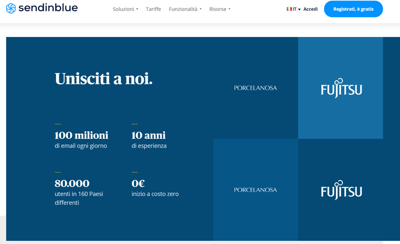
Sendinblue, a SaaS platform for email and relationship marketing, makes large juse of social proof on its home page, where they boast about their popularity, experience, reach, and expected initial investment by means of numbers, as well as reviews by existing users.
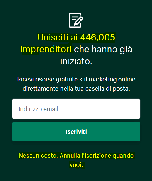
Shopify, on the other hand, to incentivize newsletter sign-up, above the CTA "Sign up" inserts the exact number of entrepreneurs who have already signed up, while below the CTA adds reassuring phrases about the service being free.
3. The difference between descriptive and standard CTAs
Not all CTAs are the same. Yes, perhaps all of them prompt action, but not all of them have a measurable and important goal.
There are calls-to-action that describe what we propose to achieve - they are placed at key points on landing pages where we expect to get a conversion, sign-up or sale.
Other CTAs, however, are only functional for navigation - those are standard CTAs.
Ideally, a hierarchy should be built, from the most important, outcome-oriented CTAs to the most functional CTAs.
Let’s see when it is appropriate to use one or the other:
3.1 Descriptive CTAs
Descriptive calls-to-action create expectation.
It is a blurred boundary - their copy is persuasive and must stand in between the promise you make and the benefit you offer. However clarity always prevails over creativity, especially in the area of UX writing.
Why are descriptive calls-to-action necessary?
-
Because they ensure a better user experience – the user knows what to expect, can quickly move across pages and eventually decide whether waiting for a page to load is worth the time and effort.
-
Because they provide a context.
-
Because you can include keywords and increase your visibility in terms of SEO.
-
Because they are more accessible – they help users with disabilities who use assistive technologies not to get lost.
Ikea ne sa e usa call to action descrittive, quasi poetiche, che iniziano con un verbo e forniscono un contesto.

3.2 Standard CTAs
Take, for example, the very well known “Learn more” - it is a quick and easy call-to-action, perhaps written by your web designer, who is not quite sure what to write about and is playing it safe. It is, however, a generic call to action as well – not really the best in terms of user experience. Let’s say it doesn't help us drive users along their journey.
But standard calls-to-action are not the ultimate evil, quite the opposite.
Why are standard CTAs useful?
-
because they allow navigation from one page to another
-
because, after a self-explanatory paragraph where they are not the main CTA, they work
-
because, as Jakob Nielsen explains in a recent research about on-the-go user experience, carried out in a mobile context where content has been stripped-down, a standard call-to-action, such as “Read more” or “Find out more”, leaves secondary content to the next page, helping retain potential customers.
Trustee Savings Bank uses a standard call-to-action following a more comprehensive paragraph introducing the product, its credit cards.

4. Examples of CTAs in different scenarios
Let’s now focus on CTAs as conversion engines – their words should be chosen carefully and have a specific objective.
What are the objectives we can measure through Google Analytics, which helps us keep track of our website or app performance?
- Sign-ups to our service or restricted area
- Payments made
- Contact forms submitted
- Newsletter sign-ups
- Conversions generated through the call to action within our newsletter.
Each interface page has its own rules and they affect the writing of an engaging CTA.
4.1 The sign-up call to action
EMOTIONS → People hate filling out registration forms with their personal information, creating new passwords, and perhaps ending up with an unwanted payment made.
CTA → The first strategy you can use is transform your call to action into a call to benefit, reminding users why their effort will be worth it.
The second one may be creating a sense of urgency.
EXAMPLES → “Get started now”, “Try it now” are must-try call-to-actions.
See how Todoist applies both on their home page:
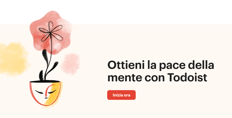
It emphasizes the benefit (the "peace of mind") instead of the burden of the action of clicking the button. In this way, the call to action suddenly seems less burdensome.
4.2 Sales-oriented calls-to-action
We all know the checkout is always a delicate stage in the customer journey.
EMOTIONS → Here the potential customer experiences mixed emotions - the excitement of taking home the product they choose or the service they will benefit from and the need for reassurance.
CTA → The call to action will, therefore, have the intent to guide the process with exact and familiar words, pandering to the need for transparency.
The payment process should run smoothly, in a few steps, and with logical and consistent information.
EXAMPLES → “Add to cart” means adding the chosen item to the cart (and not buying it).
WHAT TO AVOID → “I take this one”, “I choose this one”, instead, are non-functional CTAs for a transparent payment process because they sound ambiguous.
Paradoxically, the more conventional and clearer the text is, the more reassuring it will sound to the potential customer who is about to finalize the payment, since they will know exactly what is going to happen.
In short, this is not really the time to be original.
4.3 The call to action on the “Contact” page
After visiting your website far and wide, your existing or potential customers may have decided that yes, your product convinces them and you are right for them. But they have a question.
The “Contact” page should be designed as the most welcoming and customer care oriented page on your site. And so is its call-to-action.
Even when they land on this page, your customers experience emotions that you will need to anticipate and manage with the reassuring words of your CTA -
-
invite the user to contact you in the most honest and helpful way you know, in line with your brand tone of voice
-
uses more exact words - if you state that they may ask you questions or make suggestions, also mention which products or services so as to personalize your call-to-action and convey a sense of dedication with respect to your efforts to solve or answer their questions;
NPR, the U.S. nonprofit organization comprising more than 900 U.S. radio stations, uses a categorization system with a specific form based on the subject of each request.


- add reassuring click triggers – Your visitors need to know that their request will not slip through the cracks of the web, because you will read it and send them your response in a specific time frame.

We at Qabiria will read your request, and we also let you how soon you can expect our response.
4.4 Newsletter sign-up call-to-action
Inviting your visitors to sign up for your newsletter is no easy feat, because even at this stage you have to overcome their mistrust:
- wild spam and high frequency of emails they themselves accepted to receive
- the loss of privacy and the transfer of one’s e-mail address to a third party.
How to motivate them to open up to a relationship with your brand?
It’s always the same story - there needs to be a significant benefit, that can have an impact on their lives, however minimal.
You can persuade them with usage tips or tutorials related to the products or services you offer; or with exclusive interviews or podcasts with experts in your field, case studies in which you offer solutions, suggestions for products, apps, services, places to visit, etc that can help them improve one of their projects.
The benefit must be specific.
Don’t just write “Get updates”, but rather “Get updates on the latest job openings in advance”.
Here is an invitation to subscribe to digital growth advisor Justine Welsh’s newsletter.
Here we see what it offers, how often, and the simplest call-to-action. Justin Welsh knows how to convey his brand personality in the other sections of his site as well.

4.5 Newsletter calls-to-action
Newsletters are a more private and informal communication channel that: allows you to start a personal conversation with those who have chosen to read you and receive your messages directly in their inbox.
Just like websites, newsletters can have different goals - you can write one to sell, or to inform, or to build a relationship.
The newsletter CTA will be consistent with its goal.
The goal. It is critical that you get it right, that you understand the benefit you are offering to your readers and explain it in the simplest way possible. You want your users to feel like they are really doing something for themselves when clicking.
As Nicole Zavagnin - Mailchimp enthusiast and author of the book Dear Friend I Subscribe - teaches us, the CTA of the newsletter should also follow best practices:
- to be clear and mindful;
- can be more oriented to who will perform the action: e.g., “Okay, save a seat for me” instead of “Reserve your seat”.
- coherent with the text that precedes it and with what will happen after the click so that it releases its effectiveness;
- placed between the body and footer;
- be a direct connection: taking clicking users exactly where they expect to land, rather than a page filled with additional links to choose from.
- be only one: if you have multiple service/product launches at the same time, each CTA should have its own newsletter.
We really like the biweekly newsletter by Italian online newspaper Il Post, which surprises us every time with an ever-changing CTA, consistent with the closing of the piece and linking to their subscription page. Their goal is clearly to encourage subscription but they do it in a very creative way that sets them apart from usual CTAs.

TIPS & TRICKS → “Yes” and “Ok” followed by the benefit at the beginning of the CTA make the reader feel a genuine burst of enthusiasm when clicking on it.
→ Reinforcing words such as “Now” + personal pronouns boost your call-to-action. Ex. Download your ebook now
→ If you want to share a free resource with your readers, such as an ebook, guide, discount, report, the wording of your CTA can be: “Get your 10% discount coupon”
Newsletter call-to-actions allow you to take a few more liberties - Since it is a more intimate channel, you can use a little originality, as long as it is consistent with the previous text.
Disclaimer: not all newsletters have a CTA.
You may send one to raise your brand awareness and get your target audience to know your product/service better. This approach has a great advantage: it will help you come across as non-intrusive and build a trusting relationship over time.
In this example by Hexospark, an email marketing platform, they are not including a real CTA,
because in this case they are just sharing an update about a new feature.
By the way, how are you fixed for copywriting for your site or newsletter?
If you need a hand in getting the word out about the benefits of your product or service, contact us and let’s figure out together if we are a good match to help you tell their story.

Check out more examples of UX writing best practices!
5. CTA design: how, where, when
Since May 2021, the new Google Page Experience algorithm prioritizes user experience and usability from mobile.
What does this update imply in terms of web design?
For a mobile friendly call-to-action:
- Prefer a button over a link because it is more easily clicked.
- Place it above the fold, that is, the topmost section of the page. On mobile, this is the part of the screen you see first, no need to scroll down.
- Assign it a position that has space around it, a color and a relevant shape in line with its importance.
The size of the button is also crucial - it has to be clearly visible to your site or app visitors.
According to a study conducted by MIT Touch Lab the average size of a fingertip is between 10-14 millimeters.

Source: uxmag.com
Conclusion
“The main goal is not to complicate the already difficult life of the consumer.” - Raymond Loewy
Aaah, a call-to-action: such a small text with such great potential! And often underestimated.
We have seen how many factors there are to consider when crafting such a tiny, yet specific and engaging piece of text to make the words before it shine.
If you have a website, you may want to make sure you have effective microcopies to help you keep the conversation with your customers up. As well as a direct, powerful and consistent call-to-action that can speak with all of them and lead you to your conversion goal.
Optimize your UX writing and CTAs now.
Having a focus on detail, customer and inclusiveness, and building valuable conversations will especially benefit your potential customers, who will find the right reasons to stay on your site, app or e-commerce.
[Contact us](/contact us) and let’s figure out together whether your texts provide the best possible user experience or whether they need some tweaking to get more engaging.