
When it comes to creating a multilingual Web site, one of the most common choices for indicating the language available is the use of national flags. At first glance, it would seem an intuitive and visually appealing solution.
However, the use of flags to represent languages is a controversial practice that can lead to various problems.
Table of Contents
Political and cultural complexity
National flags represent countries, not languages.
Associating a language with a single flag carries political and cultural implications that risk alienating or offending some users. For example, the Spanish language is spoken in many countries, including Spain, Mexico, Argentina and many others (to be precise, as many as 21 nations have Spanish as an official language). Using the flag of one of these countries to represent Spanish may seem exclusive or unrepresentative to users from other Spanish-speaking countries.
Similarly, there are regions with significant political tensions where the use of a specific flag could be problematic.
Take the case of the Chinese. Using the flag of China to represent the Chinese language might be controversial for Taiwanese speakers, who also use Chinese but have a different flag. Political sensitivity can negatively affect the user experience, generating resentment and misunderstanding.
The case of Quebec is also significant.
Websites with an international audience that offer only one version in French, not specifically localized for France or Québec, usually display the French flag: québecers recognize the flag of France and know that it represents the French language.
Other websites, which have separate localizations for France and Québec but still have international reach, usually display the flag of Canada, accompanied by the name of the language, i.e., "Canada-English" and "Canada-Français."
Within Canada, the issue can stir controversy. Contrasting the flags of Quebec and Canada can be perceived as a political pronouncement in favor of Quebec independence. Some Québec-based companies are aware of this and use the two flags with this political purpose as well.
The issue is further complicated when considering that there are other French-speaking communities in Canada: the Acadians, the Franco-Ontarians and the Fransaskois, just to name a few. Each group is proud of its own identity and has its own flag. There is no flag that collectively represents French-speaking Canadians. It follows that not all communities appreciate the fact that the French language in Canada is represented only by the flag of Quebec. Not surprisingly, the Québec institutional website itself prefers to indicate the language selector with the names of the two languages, "English" and "Français."

Usability and confusion
The use of flags can also be counterproductive from the point of view of usability, that is, the measure of ease and efficiency with which a user can interact with the site to achieve his or her goals with satisfaction and without difficulty.
Users should immediately recognize that the flag represents a specific language. It is true that a native speaker usually knows the flag of his or her country, but there are situations that can be confusing.
For example, in the absence of a site’s translation into Italian, an Italian user might want to navigate the site in French instead of the site’s original language, the English. If you are unfamiliar with flags, you may not recognize the French or other French-speaking country flag on the menu, and therefore may not understand that clicking on it will access content in French.
In addition, some flags resemble each other, especially when they are small in size or simplified for space or design requirements, causing further confusion.

Flags such as those of Norway and Iceland, or Australia and New Zealand, or Ireland and Italy have very similar colors and designs and can be difficult to distinguish quickly, especially when viewing the site on a mobile device, on a small screen, or in poor lighting conditions. This can lead to a frustrating user experience where people accidentally choose the wrong language.

Inclusiveness and accessibility
Accessibility is another important aspect to consider.
Users with visual impairments may have difficulty identifying flags. Screen readers, used by blind or visually impaired people, do not always interpret flag images effectively, especially if the images are not accompanied by adequate text descriptions. Using plain text to indicate available languages is much more accessible and inclusive.
Language and regional varieties
Flags fail to adequately represent the variety of languages and dialects. For example, English is spoken in numerous countries with significant variations, such as the United Kingdom, the United States, Australia and Canada. Using a single flag to represent English can be misleading and may not reflect the linguistic diversity within this language.
Besides, different countries have different cultural characteristics. Content intended for different countries should be adapted to take into account the cultural specificities of each audience. For example, an effective marketing campaign in the United States may not have the same impact in Australia because of differences in values, consumption behaviors and holidays.
Not to mention the case of countries where several languages coexist, such as Switzerland, Spain or Canada.
If a user clicks on the Swiss flag in a language menu, does he or she know a priori in which of the four official languages (German, French, Italian, and Romansh) the site will be displayed?
In Spain, linguistic complexity is particularly evident. In addition to Spanish (Castilian), other official languages are spoken in other regions, such as Catalan, Galician, and Basque. Using only the Spanish flag to represent all these languages can be misleading and fail to respect the cultural and linguistic identity of the different communities.
Alternative solutions
Fortunately, there are better alternatives to using flags to indicate languages on a Web site. Here are some more effective options for configuring the language selector or language menu, the so-called language switcher.
Menu of textual languages
As we have already seen, the clearest and most direct option is to use the full name of the language written in the language itself. For example: “English”, “Español”, “Français”, etc. in a menu located in a more or less prominent point on the page depending on how important the choice of language is to the activity. In the case of sites in the tourism industry, the language selector is usually in the main menu or otherwise prominently displayed. Instead, if an activity is a service available for only one market and you offer language as just an extra "convenience" for foreign users, the selector will be placed in a less relevant place on the page.
A text-based language menu eliminates any ambiguity and facilitates understanding for all users. By clicking on the language, the user accesses the site in that language.
If the number of languages is reduced (two languages), the choice is made by clicking the selector and choosing the other language’s.
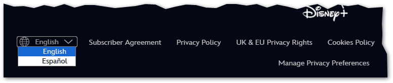
Sometimes the menu may be in the footer, as in the case of Microsoft...

...or as in the case of the BBC. British public television prefers an explanatory text as a link to the language pop-up, ‘BBC in other languages’:

Menu of textual languages in a drop-down menu
Another way to save space is to enter the language names in a drop-down menu.
This drop-down menu (also called ‘drop-down’) can be hidden behind the name of the active language, or behind a globe icon (as we have chosen on the Qabiria site) or another symbol identifying languages.
Example of a drop-down menu hidden behind a globe icon](qabiria-language-selector.png?classes=img-fluid)
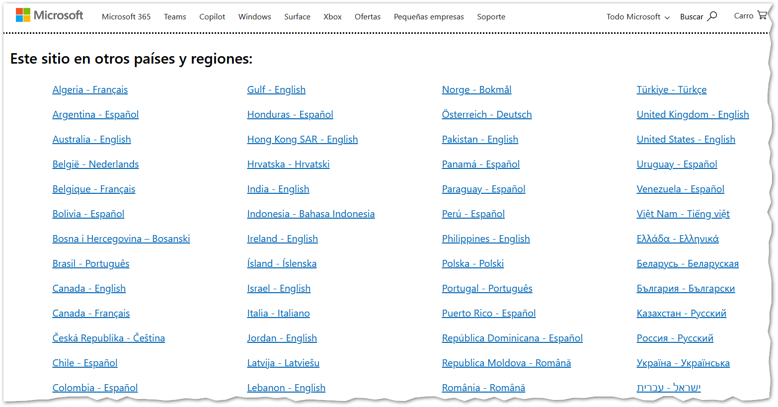
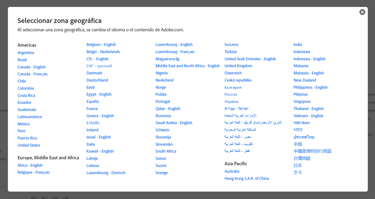
Textual language menu accompanied by the name of the region
If there are many languages, when you click on a language, you will be redirected to a page or pop-up with the complete list of languages and countries, as is the case for instance on Microsoft’s site (page) or Adobe’s site (pop-up).
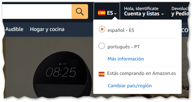
Language menu with ISO codes in a drop-down menu
In some cases, languages can be indicated by referring to their standardised code (ISO), with or without the full name, or by using other abbreviations, as long as they are easily understood by users.
Amazon Spain use this option: the flag combined with the ISO code, which is then made explicit in the full name of the language when clicked.
Automatic language detection
The importance of automatic language detection should also be emphasised: is a feature that selects the language according to the user’s location or browser settings.
When a user accesses a site, the system detects the presumed preferred language and displays the content accordingly.
This approach is quick and requires no action on the part of the user, making the browsing experience smooth and immediate. It is particularly useful for new visitors who may not know how to manually change the language of the site, especially if it is placed in the footer of the site or behind some icon that is not immediately understandable.
However, automatic detection is not infallible. If the user is travelling or using a VPN, the system may select an undesired language. For example, an Italian user travelling in France might see the site in French, even if he prefers Italian.
To avoid inconvenience, it is advisable to always combine automatic detection with a manual language selector. This allows users to easily change the language if the default language is not correct.
Care must also be taken to configure automatic detection to be secondary to manual selection. In some, very annoying cases, after changing the language by hand, the site changes it again, e.g. when loading a new page.
Conclusion
Ultimately, the use of flags as an indicator of the language of a website is not a good practice for several reasons. The political and cultural implications, the confusion created in terms of usability and accessibility issues make this a problematic choice.
Opting for alternatives such as the use of plain text, drop-down menus and universal icons can significantly improve the user experience, making the site more inclusive and accessible for all. When it comes to representing languages on a website, clarity and inclusiveness must always be the priority.
Need help internationalising your site? [Contact us without obligation](/contact us)!