Table of Contents
The three factors:
It will have happened to you too: you search something on Google, you open one of the first results and then leave the page after three seconds. All it takes is a glance for you to decide that the page isn’t what you’re looking for. Why? Because you can’t find the information you’re looking for right away, because it’s long and you don’t want to read it all, or simply because nothing grabs your attention.
The readability of a text therefore influences both the reader’s behaviour and their how engaged they are. What techniques can you use to keep them from getting away?
Before we dive straight into the details, let’s take a crash course of the basics: How we read on the screen and how we read on paper are two different things.
Reading speed changes from one to the other, decreasing by 25-30% online.
But more importantly, we don’t read every last word from beginning to end, like we do with books. What we do is explore the content of a text: we immediately notice the elements that stand out, like headings, bold text or bullet points, to understand if what we are looking for is there.
The three factors we need to keep in mind when writing web texts are:
- graphic appearance
- readability
- intelligibility
Graphic appearance
As expected, when faced with a web text we do not read word for word, but rather carry out a “scan", and fix on elements that grab our attention.
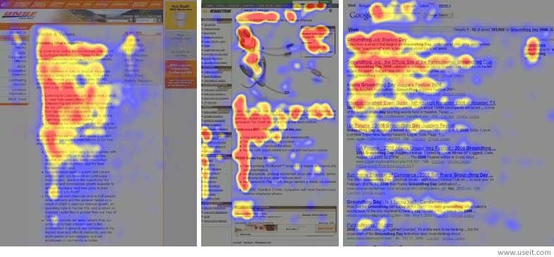
How we read on the web: Nielsen’s studies
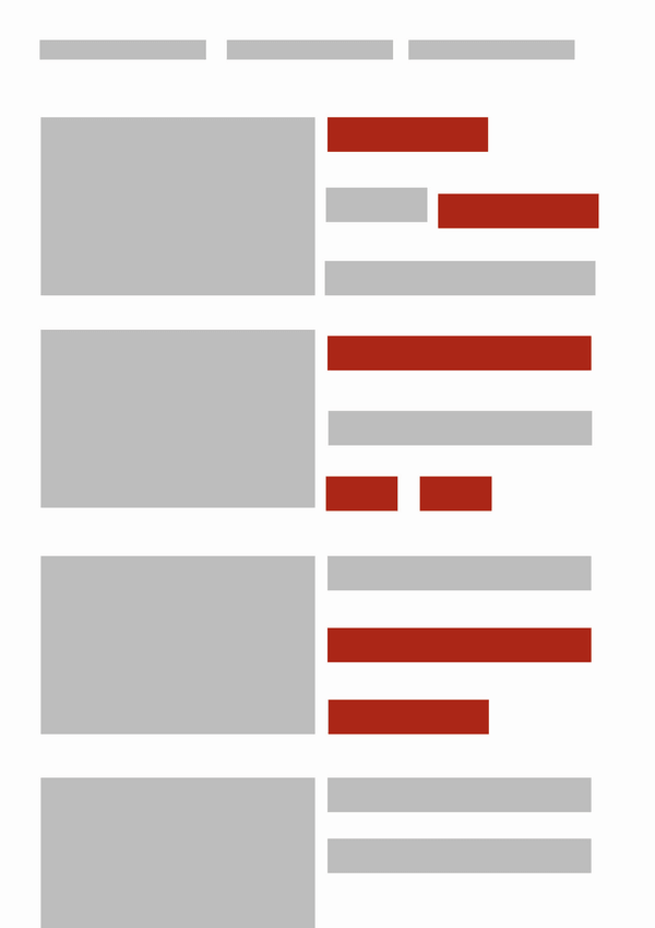
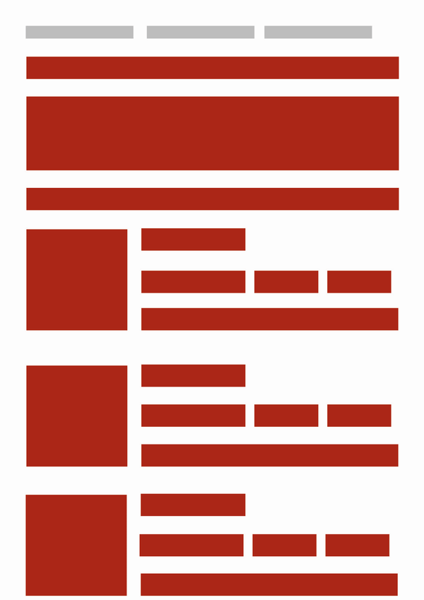
Danish usability consultant Jakob Nielsen conducted so-called “eyetracking” studies, recording the way a reader’s eye moves across the screen and identifying recurrent patterns. The most frequent is the F-shaped pattern, so called because the eye moves around the screen in an F pattern. A closer look:
- The eye scans horizontally - the user reads the first sentences at the top of the page (this is the first horizontal stroke of the F)
- The eye then scans downwards and again horizontally - the user reads the first words of each sentence (this makes the second horizontal stroke);
- Finally, it scans vertically down the left side of the page - the user skims the content by scrolling down (this is the vertical stroke).
So the reader’s attention is focused on the contents at the beginning of the page and the first words on the left. The red areas in these images, taken from Nielsen’s website, show the parts of the page where the readers’ eye dwelt longer:
 (J. Nielsen 2006)
The eye movements can be outlined as follows:
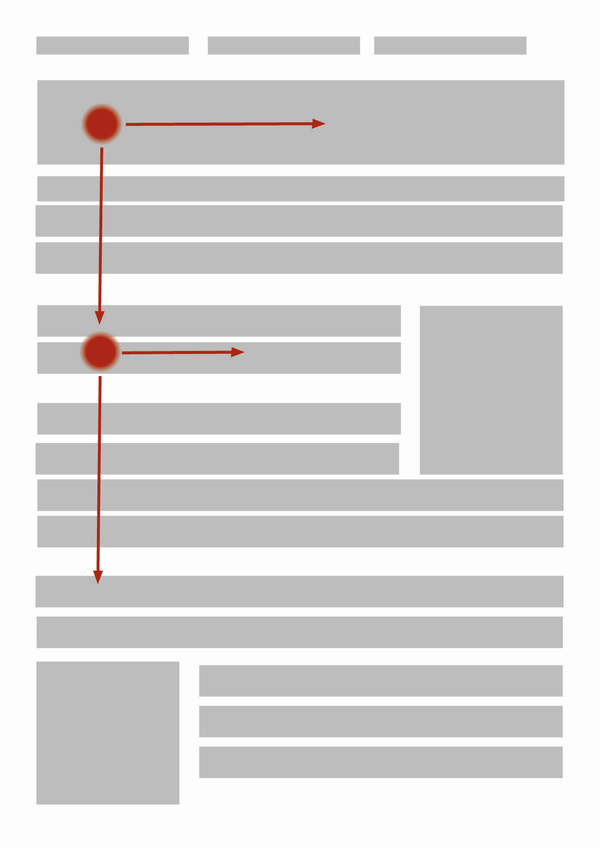
The F-shaped pattern is not the only reading pattern identified by Nielsen. There are other patterns.
- Layer-cake pattern: the reader skips the text completely to search for headings and subheadings. The eye draws horizontal lines reminiscent of a layered cake, hence the name of this technique.
- Spotted pattern: the eye searches for elements that attract attention and so draws dots on the screen (a link, a word in bold or a different colour).
- Marking pattern: While the user is scrolling through the page, their eye will fix on a certain point. This pattern is most commonly observed on smartphones.

- Bypassing pattern: if several lines all start in the same way, the user will skip the beginning so as not to have to read the same words repeatedly.
- Commitment pattern: this pattern is rarer, and is the reading technique of those who are careful to read everything - the entire paragraph or the entire page. This occurs when the user is interested in the content.
Making reading easier
Knowing how readers behave allows you to organise the content and graphics of your texts. Here are some tricks to have up your sleeve:
- put the most important information in the first two paragraphs
- use headings and subheadings to introduce a topic and make it clearly visible
- insert keywords into headings and subheadings
- divide the content up into paragraphs
- link each paragraph to a particular concept
- use bold lettering to highlight words or phrases (don’t use underlined lettering because it suggests a hyperlink)
- format hyperlinks in a way that makes them recognisable
- instead of using generic words like go to or here for your hyperlinks, use keywords
- use bullet points or numbered lists to present a series of elements or instructions in an orderly way
- be brief, cut out any unnecessary information
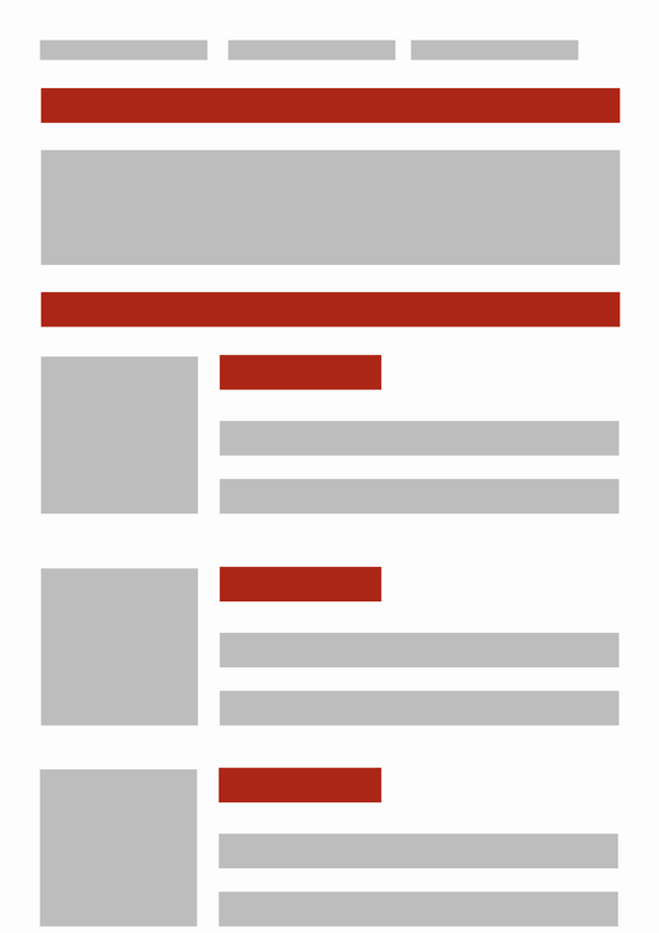
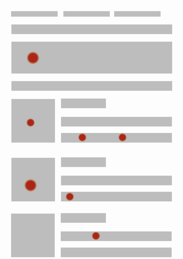
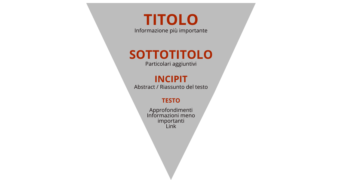
The inverted pyramid
According to recent studies conducted by Nielsen, readers dwell 74 percent of the time on the first and second screens (i.e., the portion of the page displayed when the site opens, then scroll down to the second screen). For this reason, the most important information should be found in the first part of the text.
This way of structuring content is called the inverted pyramid and the structure is:
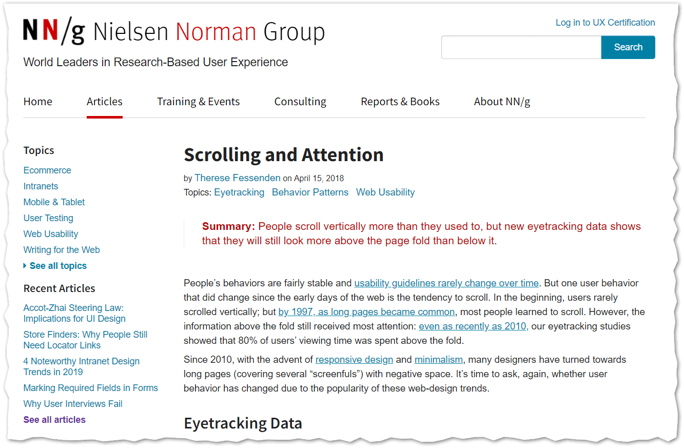
Let’s take Nielsen’s site as an example.
 (J. Nielsen, 2018)
In the upper part of the first screenshot, we see the heading, followed by two lines of text in red, which clearly present the main concept and a summary of the article. It’s everything we need to get an idea of the content and see if it’s what we were looking for. The rest of the text, not seen here, is divided into paragraphs introduced by bold subheadings.
Font, Line-Spacing, and Alignment
The choice of typeface, line spacing and text alignment can also help or hinder reading. Some things to remember:
- choose an appropriate font size
- try to use sans-serif fonts (like Arial, Verdana, Calibri or Helvetica) because some find them easier to read
- keep the lines well spaced
- pay attention to contrast with the background
- stick to left-hand (or flag) alignment: the justification should be suitable for printed paper, not for the screen because, if a window is resized, it risks creating excessive and unsightly spaces between words.
A Brief Note on Accessibility
Creating a well-structured web text, making it readable and understandable - these are all essential, but there is another element to consider: accessibility.
Accessibility doesn’t relate so much to individual texts as to a website as a whole, and it is a legal requirement. In the European Union, this is enforced by the EU directive on web accessibility. In the USA, web accessibility regulations are not legally binding in the public sector. At the international level, however, we can also refer to the Web Accessibility Initiative (WAI) promoted by the World Wide Web Consortium (W3C), the international non-profit organization that defines the standard languages and procedures to make the web a democratic and universal tool. The WAI has drawn up [guidelines] (https://www.w3.org/TR/WCAG21/) for making web content, browsers, and software for content writing and publishing more accessible.
Accessibility is not just about disabilities
For a definition of accessibility we recommend the words of Tim Berners-Lee, director of the W3C and inventor of the World Wide Web: The power of the Web is in its universality. Access by everyone regardless of disability is an essential aspect.
According to Berners-Lee, web accessibility should be guaranteed both to those who have a form of disability (auditory, visual, cognitive, etc.) and to those who are not disabled. Anyone can benefit from an accessible website, from smartphone or small screen users, to people with temporary disabilities such as people with broken arms or who don’t have their glasses with them, and people with a slow or expensive internet connection.
Accessibility as an opportunity to expand your market
Accessibility should not be looked at as a legal requirement or an additional burden, but rather as an opportunity. Making your site accessible helps you expand your market, because a user who can’t navigate or read your content is a lost customer. Let’s take the HTML “alt” tag as an example, whose value should contain the alternative (invisible) text that describes the content of an image on the page.
In this example, we see the image and the source code with the associated “alt” tag:

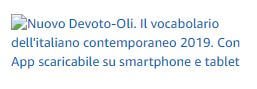
The “alt” tag is read by screen readers or voice browsers and allows the blind or visually impaired to understand its content, as well as displaying it to anyone when the image is not available. Not using it in e-commerce is equivalent to excluding a part of the market. If we take the previous image as an example and block it, we see the “alt” tag appear in its place:
![]()
readability
When we talk about readability, we are talking bout how easily a text can be read. A text’s readability depends on its lexicon and its syntax: short words and simple sentences make a text legible. The code word here is simplification.
We’re all familiar with Officialese, the jargon of institutions and public administration, full of endless sentences, subordinate clauses, long words and ambiguous meanings. This is exactly what we want to avoid.
So, instead, try using short words. Write sentences of 20-25 words or less, and avoid subordinate clauses or digressions. Remember that any topic, even the most difficult one, can be presented in a simple way.
Measuring a text’s readability
How do I check the legibility of a text? There are mathematical formulae that measure how easily readable a text is. There are several tools available.
The Flesch Reading Ease Formula
The Flesch Reading Ease Formula was created in English, and the original version has been adapted to other Latin alphabet languages. It assesses the legibility of texts, taking into account the average length of words measured in syllables, and the average length of sentences measured in words. It is based on the principle that:
- short words should be favoured over long ones
- short sentences usually have a simpler structure than long ones
The formula is:
where: S = number of syllables vs total words and W = average number of words per sentence
The values are based on a scale of 0 and 100, where 0 has the lowest readability and 100 the highest.
Other formulae
Unlike the Flesch-Vacca index, the Gulpease index was developed for the Italian language.
- the Flesch-Kincaid Index in Spanish.
- the Gulpease Index in Italian.
The formula is:
where: LW = letters × 100/total of words and ST = sentences × 100/total of words.
The value obtained is between 0 and 100 and divides readers into three levels of education:
- those with an elementary education will have no trouble understanding texts with an index greater than 80
- those with an average education may easily understand texts with an index higher than 60
- and those with higher education will easily be able understand texts with an index higher than 40.
For example, a reader with an elementary education will find it difficult to read a text with an index of 50. How can you check the legibility of your texts? The easiest way is to use special online calculators.
Coherence
Up to now, you have learned how to structure in a graphically appropriate and readable way. In this final point, we will explain how to make it coherent.
Comprehensibility, unlike legibility, is the ease with which a reader understands the meaning of a text.
Identify your audience
Who is your text addressed to? Use technical terms if you are looking for specialists, otherwise make the meaning explicit or choose a more general vocabulary. Adapt the text to the age of the target reader: if you’re targeting an adult audience, avoid using teenage expressions: they might not be understood.
Specify the purpose of the text
Is your text informative or is it meant to convince the user to do something? Make sure the aim is clear to the reader. For example, if you have planned an event, make the time, date, place, and registration visible.
Use images and graphics
In addition to attracting attention, images, graphics and infographics allow you to summarise information and visualise concepts. They’re perfect for people who don’t want to read.
Write short sentences and use simple words
- Each sentence should express just one concept.
- The subject, verb and complement should always be close together.
- Go for words that everyone understands: you can get help from a Basic Vocabulary that collects the words most widely used and understood by a majority of speakers. The words not included are less easily understandable for those with a lower level of education or for those who don’t read much.
- Use repetition for emphasis and to mark sentence rhythm.
- Write numbers in digits: they’re easier to read and they attract attention.
- Use foreign words only if you have no other choice. Ask yourself if the reader will know the meaning and if you are using the right word. If you make a mistake and the reader notices it, you’ve made a bad impression. Also remember that not everyone knows English.
Between readability and comprehensibility: practical examples
Just a few small steps can be enough to make a text more readable and understandable. Here are some suggestions:
| Rule | No | Yes |
| Be direct and avoid being long-winded: instead of using terms like on the off chance that or in the event that, just use if. | Should you wish to get in touch | If you want to contact us |
| Do not use the gerund, especially at the beginning of the sentence. | The withdrawal limit has been reached | You have reached the withdrawal limit |
| Be concise. | The manual that contains the instructions | The manual containing the instructions (even better: The instruction manual) |
| Where possible, choose active forms rather than passive ones. | The document was sent on... | I sent the document on... |
| Also choose the active form over the impersonal. | Contacting X is recommended | We recommend you contact X |
| Use shorter, more concise words. | The subject matter at hand is extremely complex Coordinate efforts with... |
It’s a very complex topic Work with... |
| Avoid longer expressions where concise ones will do with a view to..., for the purpose of... simply use “to”. | In order to put this more simply | to simplify |
| Avoid verbs followed by infinitives or nouns: instead of “proceed to purchase”, use “buy”. | When you have finished, please go to the “proceed to purchase” page | When ready, please click “buy” |
| Choose verbs over nominalisation (transforming a linguistic element into a noun) because they slow down reading and make it heavy. | Specified email delivery failure | The specified email was not sent |
Conclusions
- The rules of writing for the web are different from the ones we learned at school. Writing a web text is not like writing an essay: The means, the way we read, and the purpose for which we write all change.
- Nobody likes to deal with institutional jargon. Write texts that are short, simple and straight to the point: everyone will appreciate it.
- Guide the reader through your text: create a visual map with headings, subheadings, bold lettering, paragraphs and images. Even those who don’t read everything will find the information they’re looking for at a glance.
Further reading
- Books by Luisa Carrada, business writer
- https://www.nngroup.com/articles/how-users-read-on-the-web/
- https://www.nngroup.com/articles/f-shaped-pattern-reading-web-content/
- https://www.nngroup.com/articles/f-shaped-pattern-reading-web-content-discovered/
- https://www.nngroup.com/articles/how-long-do-users-stay-on-web-pages/
- https://www.nngroup.com/articles/page-fold-manifesto/
- http://www.mestierediscrivere.com/articolo/letturaweb_nielsen.html
- https://it.wikipedia.org/wiki/Indice_Gulpease
- https://translatedlabs.com/leggibilità-del-testo
- https://www.html.it/pag/15788/le-linee-guida-w3c-e-la-legislazione-italiana/
- https://www.w3.org/TR/WCAG10/#glossary
If you want help improving your texts, get in touch.