
Table of Contents
- Use anchor text to communicate value
- Make links self-explanatory
- Write links of the right length
- Avoid confusing links
- Format links according to standards
- Follow accessibility norms
- Exposing URLs, yes or no?
- How to format download links
- When to use a link and when to use a button?
- Avoid clickbait links
- Conclusion
When thinking about the factors that determine the success of a website or email campaign, probably the way links are written is not at the top of your to-do list.
However, proper formatting of internal and external links, i.e., use anchor texts properly, is an essential part of search engine optimization (SEO) and also one of the best practices of email marketing.
It may not be a fascinating topic, but having self-explaining, transparent, easily detectable and accessible links has a positive impact on the way users, crawlers and screen readers see your website and emails. Links are one of the first indicators of a site’s value and trustworthiness, so it is important to write them in the right way.
Use anchor text to communicate value
Anchor text is the clickable text you see when creating a link. While the link text is what crawlers see, the anchor text is what users see. Even if it is not that important in terms of SEO, you should use it to communicate value to your users.
When you create links between your site and other sources, consider the value you are communicating with that link. Choose words that reflect what the link will offer the user.
For example, if you are creating a link to an article with pro tips on how to start a business, use anchor text like "How to start a business" and don't just put the name of the target site or text like "Click here" or "Read more."
When including a link in email communications, make use of anchor text to help users navigate content. This is especially important in newsletters, which do not always have a clear structure or pattern.
In a nutshell: include keywords in the anchor text of a link to improve readability and allow users to quickly find what they are looking for.
Make links self-explanatory
When you create a link to another page or resource, the link text you choose must be relevant to the content the user will see once they click it.
That’s why, as we saw earlier, it is wrong to use the typical "Click here" as the link text. If links do not clarify the nature of the linked content, readers will either not click, or they will without understanding why the link is there and what it should mean to them.
| Bad example | Good example |
|---|---|
| Fill in the form through the link | Fill in the contact form |
| Always follow these text formatting guidelines | Always follow these text formatting guidelines |
| Open a ticket here | Open a ticket |
Write links of the right length
Make the user’s life easier with longer texts that are easy to press with their finger if they are viewing the page on a mobile device.
You have to think that the link text should also work out of context, because users often scan the page and fully read only on the text that stands out from the rest.
So links also help page skimming and should always be formatted differently than text without hyperlinks.
You can use the table above as a reference: links in the good example column make their content explicit even outside the context of the sentence and are long enough to be clicked on without any problems.
Avoid confusing links
When you create hyperlinks to other sources, you have a responsibility to be transparent about where users are directed to. To avoid creating misleading links, you must make the destination of the link obvious.
When linking from one website to another, always make it clear that users will be directed to another source and what they will find there.
Make sure the link takes the reader to the listed page. A link from your site that directs users to another source and then takes them to the wrong page is an easily avoidable mistake that undermines your website’s credibility.
Some websites, especially shady ones, create link chains: you click a link that takes you to another site, which redirects you to another one, and so on. These nefarious practices make the user feel confused, suspicious, and often deceived. Refrain from following them. The clearer your links’ path is, the more trustworthy you will be in your users’ eyes.
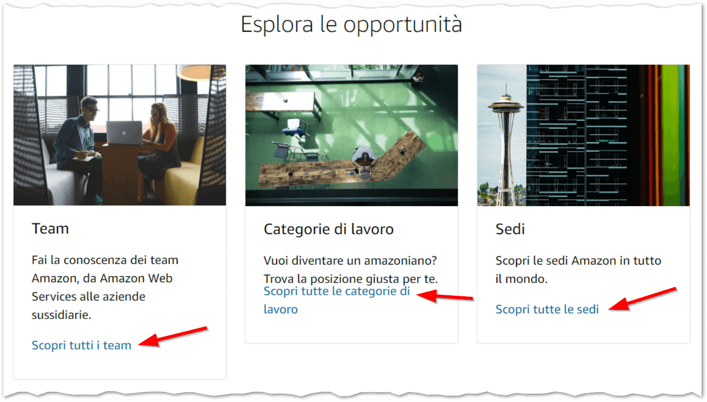
For example, Amazon Jobs clearly indicates the destination of their links. This way the user knows exactly what to expect from the landing page.
Format links according to standards
To properly place links in your text you can follow the standard guidelines created by Jakob Nielsen, one of the pioneers of Web usability.
- Color and underline the link texts to distinguish them from the rest of the text and improve clickability. Underlining is not necessary if links are in a list or menus, however, it is essential to ensure content accessibility.
- Never underline text that is not a link, even if you do not use underlining as a standard, because this type of formatting is strongly associated with the ability to click an item.
- Use different colors for open and unopened links: unopened links should have brighter and more saturated colors than unopened links, making sure to choose two variations of the same color. Generally speaking, blue is the color most associated with links. To make this variation accessible to color-blind users, unopened links can be signaled by changing settings for sharpeness and brightness.
- Do not use the chosen color for links to color text that is not a link. In general, never use blue to color any text other than a link.
- Do not use special colors or other display effects when the mouse hovers over a link, especially do not use bold text.
- Do not use smaller text (except for rarely used links, such as copyright information, if located in a secondary position to the body of the page).
Follow accessibility norms
Make sure links are accessible to all users. This means avoiding interactive elements, such as auto-playing audio or other features that are not accessible to users who are visually impaired or who rely on automated screen-reading tools.
Make sure that all interactive features are clearly marked as such so that readers know what they are clicking on and what they might expect from it.
Keep in mind that users with disabilities use screen readers and speech recognition tools to interact with web content. Therefore, it is essential that links are well structured and that the choice of words for anchor text is clear. The choice of colors is also critical, as color-blind people may not distinguish the color of the link from the rest of the text.
According to the Usability & Web Accessibility guide by Yale University, to make your links accessible:
- don’t write the urls in full, because screen readers read them one character at a time (h-t-t-p-colon-slash-slash-w-w-w...);
- don’t use phrases that are too vague such as “Click here”, “Learn more” for the anchor text. Good anchor text should convey the purpose of the link and be understandable even if taken out of context, as we said before;
- use unique references for links, so don’t use the same word for two different links and don’t use different words for the same link on the same page;
- don’t use whole sentences or paragraphs as anchor texts;
- don’t include images in links; if necessary, always include an alt text indicating the position of the link on the page and the purpose;
- don’t insert multiple adjacent links, as people with impaired motor skills may have trouble selecting the right one. If your target audience includes elderly people, it is better to use a larger font size;
- don’t use colors to identify links, but use other indicators instead, such as underlined text (permanently, not just on mouseover) or icons. If you must use colors, be sure to use shades that are recognizable to color-blind users.
Exposing URLs, yes or no?
If you want to follow accessibility guidelines, you should never use the URL itself as the anchor text. However, you can break this rule sometimes.
If the URL of the linked resource is short and easily readable, it may be worth exposing the URL directly, rather than using a different anchor text. This makes it easier to copy and paste the link.
| URL not exposed | URL exposed |
|---|---|
| Complete the contact form | Complete the contact form: https://qabiria.com/en/contact-us |
On the other hand, if the URL is very long or consists of a meaningless sequence of characters, but you still want to expose the URL, you can use a tool to shorten the URL, such as bit.ly or similar.
Warning! The above applies: if the generated short URL is not explicit, meaningful and transparent, users may not click it because they consider it dangerous.
Examples:
bit.ly/40SjWa9z(suspicious and unreadable url)bit.ly/contact-from(url with clear topic)qabiria.com/akd04Gd(url with recognizable domain)qabiria.com/contact-us(fully transparent url)
How to format download links
If you have to insert links to downloadable resources, such as PDFs, videos, or presentations, you should:
- clearly indicate the type of file the user will download when clicking on the link, adding the extension in brackets or a file type icon;
- state the downloaded file size; not all users have high-speed internet access and may want to avoid downloading many megabytes, especially if connected from a mobile device that may have limited storage, an unreliable connection, or limited bandwidth.
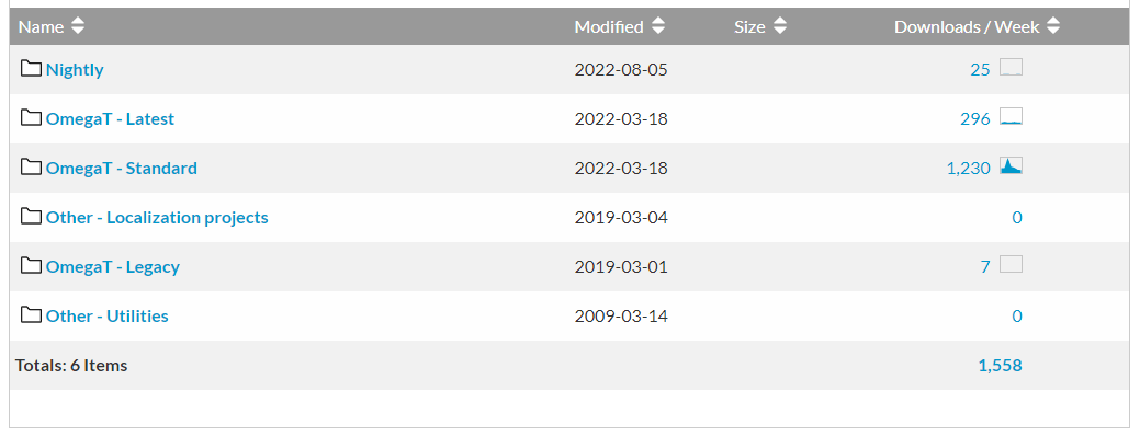
When resources available to download differ in only a few details, such as versions of the same program, the text should be structured so that the user knows exactly what to download at first glance.
Download 7-Zip:
In this example, however, the difference between the available versions is not sufficiently explicit and causes confusion to the user, who is not sure what to download.
When to use a link and when to use a button?
There are elements in a text that are more important than others and those can be highlighted in bold. The same applies to links.
Buttons are created to attract the user’s attention to actions of some relevance, so it is good not to overuse them, otherwise they will lose their function.
In contrast, links can be used freely, as they are used to navigate the site. The general rule is:
- use buttons for the most important actions, i.e., those that affect the front end (e.g., creating a post) or the back end (signing up for a newsletter) of the site, basically, for the CTA;
- use links for all other less important actions that do not affect the website (e.g. to direct the user to another page).
Buttons do not just attract attention; they must encourage the user to take an action. So the text must be clear and imperative:
- “Sign up to our newsletter”
- “Buy tickets"
- “Get to document”
- “Download the recording”
Creating a compelling button is not easy. Honesty always pays off, so avoid creating a button to an action when in fact the button initiates another intermediate one (e.g. an advertisement). That’s the case of many online storage platforms that force the user to click banner after banner after clicking the “Download” button.

Avoid clickbait links
Another key element of building a link strategy is to avoid clickbaiting.
Clickbaiting happens when there is a "catchy" link with sensational or shocking text that prompts readers to open it. The purpose is to increase views or clicks on a page so that it can generate revenue through advertisements, but the content of the page often brings no value to the user.
There are several clickbaiting techniques, including:
- trolling and insulting pages about other sources, only to draw attention;
- articles with misleading titles;
- pseudo-information articles and fake news;
- fake advertisements;
- raising awareness on topics with no real value;
- use of misleading or graphic images.
Clickbaiting is not only harmful to readers, but it can also harm your website. Google has taken steps to penalize sites that use clickbait elements and has included very strict policies to prevent misleading advertisements.
Conclusion
As you can see, links are more than just a part of the basic structure of the Web. They are the foundation of communication and collaboration between websites.
It is important to pay attention to the way links are displayed on websites and their design. If links are misleading or are seen as spam, they damage your site’s reputation and make it harder for users to find what they are looking for, penalizing the conversion rate.
To be effective, your links must be easy to use, transparent and accessible to all users. That’s the only way you can ensure that your links are solid and take full advantage of their ability to bring traffic and engagement to your site.
Do you need help writing and formatting your content in the best way? Contact us and we will find the best way to help you.